Introduction
A picture speaks a thousand words, or so the saying goes…
Diagrams are an integral part of system design. Whilst wordy requirements can hide a lot of ambiguity, and mask an author’s understanding, or lack of, a diagram holds that understanding up to the light; “this is how I think it looks”, “these are the states an entity will pass through”, “this is the logical flow as we process an entity”, “this is the sequence of interactions between the components”. It’s all there, in black and white (and maybe some colour for the creatives).
Different diagrams serve different purposes and require different levels of detail and understanding. Our choice of diagram can have a material impact on the quality of the software that is developed, and create oppotunities for missing functionality and serious defects.
As it’s Christmas, let’s consider a non-technical scenario that we all understand: the delivery/non-delivery of a parcel….
The Logical Flow
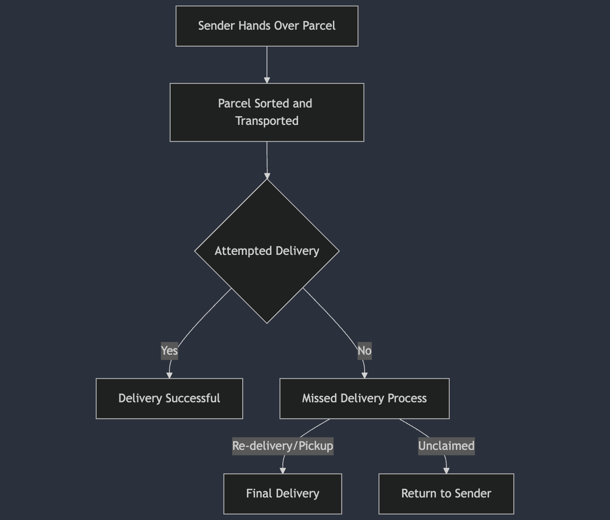
This flow diagram diagram provides a reasonable (for this example at least!) represeantion of the logical flow in the delivery of a parcel. Most people could look at it and understand it. But there is a big difference between this high level flow, and actually being able to build a reliable delivery network.
- Who even touches the parcel?
- Who is responsible for carying it to the delivery address?
- Who physically returns it to the sender?
Being able to answer these questions is the difference between the parcel moving correctly from the Sender –> Sorting Facility –> Recipient, and being left in a warehouse somewhere, uncollected or undelivered.
Who’s Job is it Anyway?
To understand a process with multiple stages, we really need to identify the actors involved, and the hand offs between them. To do this, a sequence diagram is a much better tool.
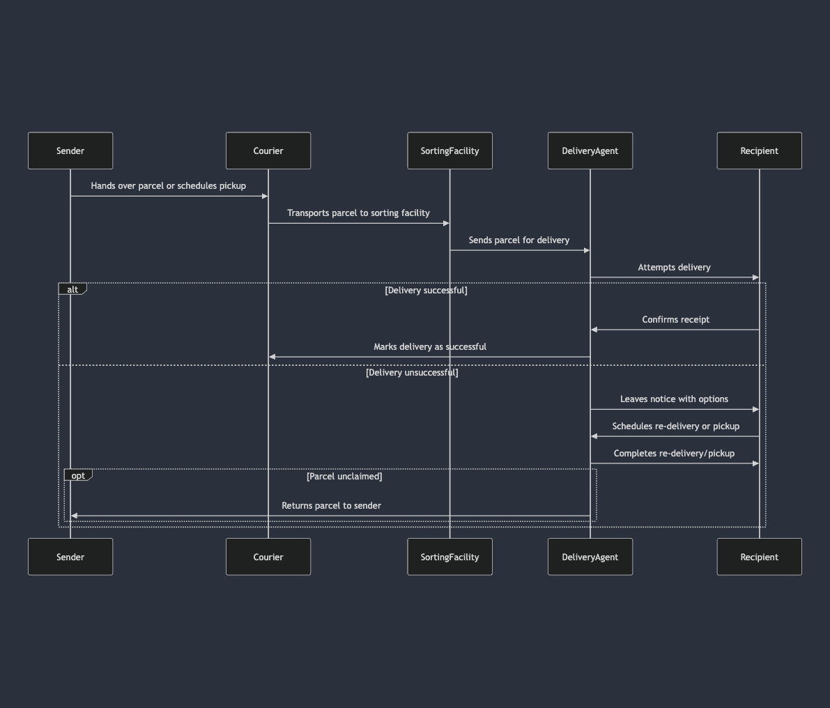
This diagram gives us a much better understanding of how our process works in terms of the people (components) and their responsibilities. We can clearly see who hands off to who, and what happens when a delivery address cannot be found.
Delving down to this level of detail helps us answer the questions that our flow diagram couldn’t. If we understand this, it is less likely that the parcel will remain underlivered.
Why?
Different diagrams offer us different levels of detail when it comes to specifiying a process. We have used a simple idea to communicate how one diagram might not offer us the detail we need, whilst another type of diagram forces us to identify this detail.
Too often, I see teams start building systems once the design is complete. The problem is that the design is often inadequate, but due to the presence of some flow diagrams, has the veneer of technical solution, ready for implementation.
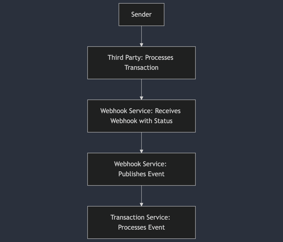
In a real life project, years ago, this lack of design detail was the root cause of a production incident.
After sending a transaction to a third party, that third party would send a webhook call confirming they had processed the transaction and provide a staus. Our Webhook Service would publish an event which would be processed by the Transaction Service, which should have then called a downstream service. The problem was that downstream service was never called. It was never called, because that integration had never been part of the technical design.
This is the diagram we had:
This is the diagram we needed:
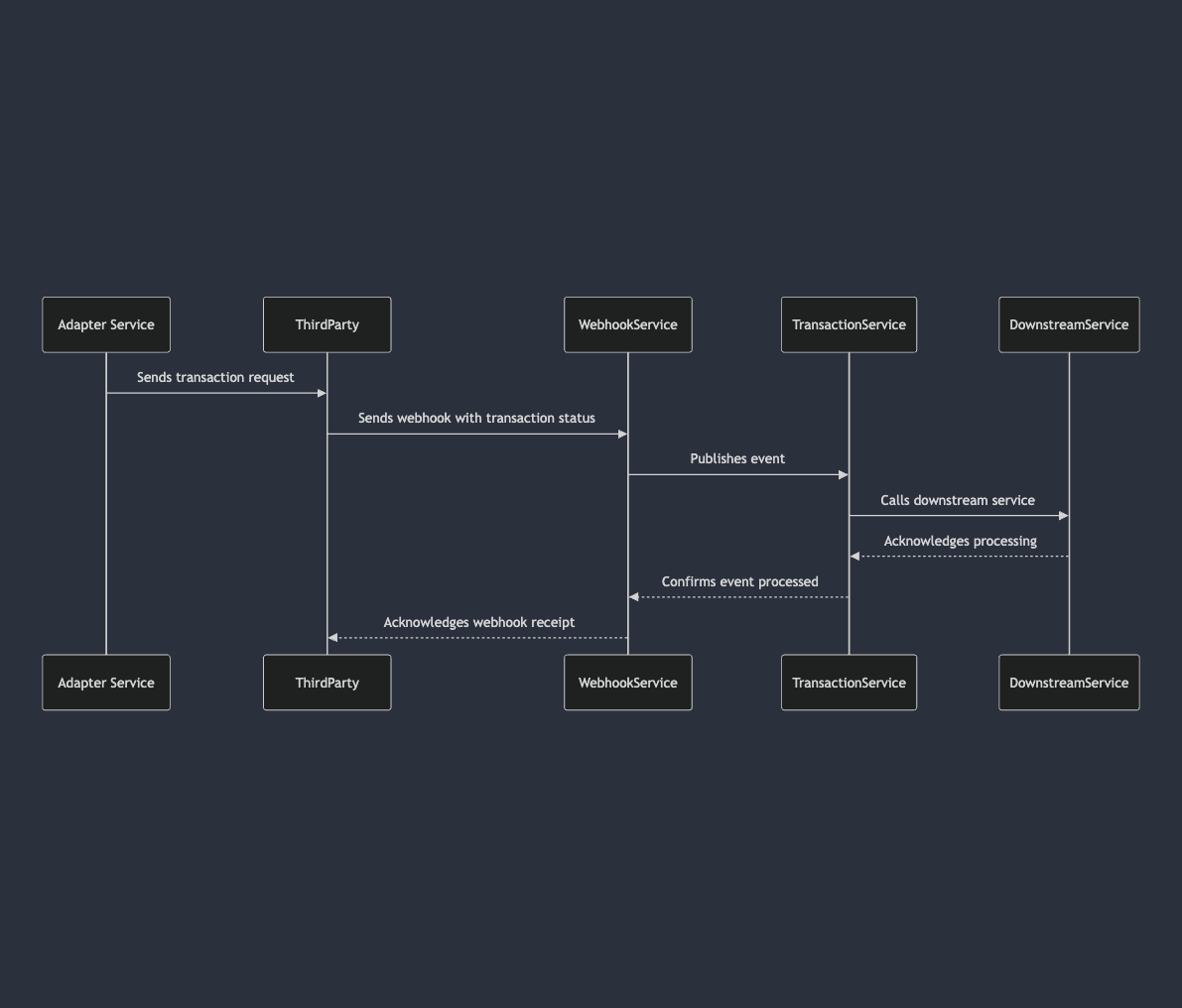
This would have created a demand for better understanding, and after a few review cycles would have undoubtedly highlighted the gaps in our understanding, most likely preventing the production issue.
Conclusions
As technical QAs, we often get caught up in fairly mundane debates around tooling (Selenium vs Playwright anyone?), or arguing over testing vs checking, but the reality is there are far more productive things we can debate and push for. Decent diagrams should be one of them, and if they aren’t being done, as technical QAs we could even provide examples as a way to build a consensus towards what better design could look like.